Responsive web design is an approach that makes web pages adapt seamlessly to different screen sizes and devices, ensuring optimal viewing and usability without needing separate versions for mobile or desktop. We at Suncode Miami see it as essential for modern websites. This method uses flexible layouts, images, and CSS media queries to create a consistent user experience across all platforms.
Let’s dive deeper. In today’s digital world, people access websites from smartphones, tablets, and large monitors. A responsive website adjusts its design and layout automatically based on the device being used. This keeps content readable and navigation easy, no matter the screen size. We know from our 10+ years in web development that non-responsive sites frustrate users and hurt business growth. Search engines like Google favor responsive designs too, which boosts your visibility.
Key Points / Quick Summary
• Responsive design ensures your site looks great on every device, from desktops to mobile devices.
• It improves user experience by making content usable and visually appealing across devices.
• Key elements include fluid layouts, media queries, and flexible images.
• Benefits cover better SEO, lower bounce rates, and easier maintenance with a single codebase.
• We recommend starting with a mobile-first approach to build efficient, scalable sites.
What exactly makes a site responsive? We break it down next.
What Is Responsive Web Design?
Responsive web design creates web pages that respond to the user’s environment. It detects the screen size, orientation, and platform to adjust the layout dynamically. We use HTML and CSS to make this happen, ensuring the website content remains accessible and engaging regardless of the device.
How did this come about? Ethan Marcotte introduced the term in 2010, emphasizing a web design approach that adapts to various devices. Before that, sites often had separate versions for desktop and mobile, which doubled the work. Now, one responsive website handles it all, saving time and resources for design teams.
Why choose responsive over adaptive design? Adaptive design serves fixed layouts for specific breakpoints, while responsive design uses fluid images and grid layouts to make dynamic changes. This means responsive web design uses a single flexible structure, providing a better user experience across all platforms. For instance, on smartphones and tablets, elements resize or stack into one column for easy scrolling.
We find this design improves accessibility too. Users with different needs benefit from readable text and simple navigation. Plus, it supports multiple devices without extra codebases.
Why Does Responsive Design Matter for Businesses?
Business owners need sites that work on any device because most web traffic comes from mobile devices. A responsive website keeps visitors engaged longer, reducing bounce rates and encouraging conversions like form submissions.
Here’s why it stands out. First, it delivers a consistent user experience across desktops, tablets, and smartphones. No pinching or zooming is required, which makes your brand look professional. Second, search engines reward mobile-friendly sites with higher rankings. We see this in our projects-responsive sites load more quickly and rank better.
Next steps? Think about your audience. Entrepreneurs and professionals browsing on the go expect usability. A site that adapts to browser width and available space builds trust. It also cuts costs since you maintain one site instead of multiple.
Let’s look at it from a stats angle. Over half of global web traffic is mobile, so ignoring responsive design means losing customers. We help businesses avoid that by focusing on design and development that elevates online presence.
Key Components of Responsive Web Design
Responsive web development relies on a few core tools and techniques. We start with the viewport meta tag in HTML to set the initial scale. This tells browsers how to handle different screens.
What about media queries? These CSS rules apply styles based on screen size. For example, at a breakpoint like 768px, you change from a multi-column grid to a single one. We use them to ensure optimal viewing.
Fluid layouts come next. Instead of fixed widths, we use percentages so elements adjust to the range of screen sizes. This creates grid layouts that flow naturally.
Flexible or fluid images scale with the layout. Set max-width to 100% so they don’t overflow on smaller devices. We also optimize for text size, making sure it’s readable without zooming.
Designers and developers work together here. We incorporate HTML and CSS basics, like flexible grids, to make the design ensure smooth transitions. This approach keeps the experience for users top-notch.
Learn about Web Development Job Description: Roles & Responsibilities
How to Implement Responsive Web Design: A Step-by-Step Guide
Ready to create responsive sites? We guide you through the process. Start small and build up.
Step 1: Adopt a mobile-first mindset. Design for the smallest screen size first, like smartphones. This ensures core content works on limited space. Add a viewport tag: <meta name=”viewport” content=”width=device-width, initial-scale=1″>.
Step 2: Plan your breakpoints. Common ones include 320px for mobile, 768px for tablets, and 1024px for desktops. Test how content behaves at each.
Step 3: Build fluid layouts with CSS Grid or Flexbox. For example, use display: grid; with repeat(auto-fit, minmax(250px, 1fr)) for adaptive columns.
Step 4: Add media queries. Write @media (min-width: 768px) { /* styles */ } to adjust for larger screens.
Step 5: Make images responsive. Use img { max-width: 100%; height: auto; } so they resize properly.
Step 6: Optimize typography. Apply font-size: clamp(1rem, 2vw, 1.5rem); for dynamic changes.
Step 7: Test usability. Use tools like Chrome DevTools to simulate devices. Check scroll, navigation, and load times.
We follow these steps in our agency to deliver sites that perform. It creates a design that makes navigation intuitive on desktop and mobile.
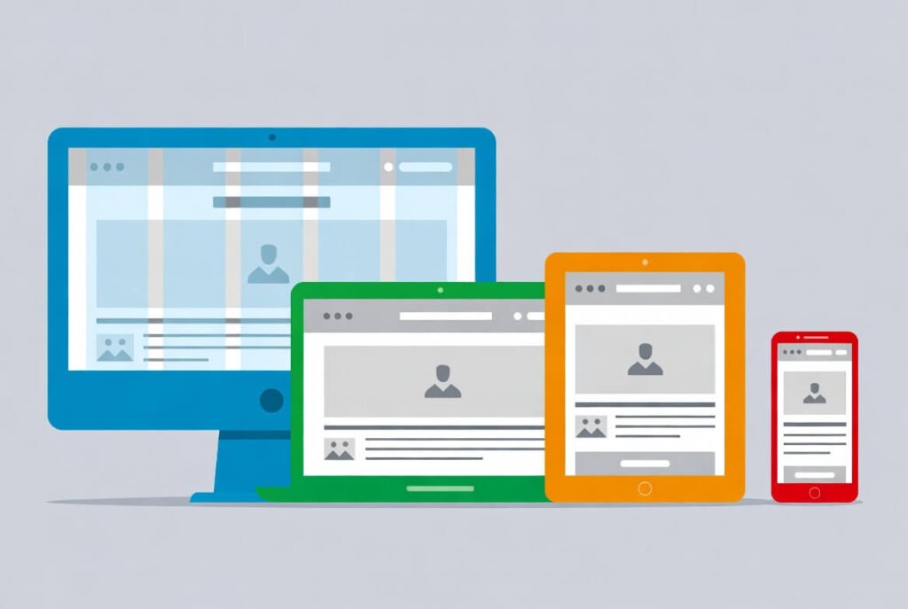
Here’s an example of a responsive website displayed on desktop, tablet, and mobile devices. Notice how the layout adjusts to fit each screen size while keeping the content accessible.
Best Practices for Responsive Web Design in 2026
We prioritize these tips to build effective sites. First, focus on performance. Optimize images and cache resources to create pages that load more quickly.
Use container queries for advanced control. They let styles depend on parent size, not just viewport.
Incorporate Bootstrap or similar frameworks. Bootstrap provides a responsive grid and components out of the box, accelerating development.
Test across real devices. Emulators help, but nothing beats checking on actual smartphones, tablets, and desktops.
Improve accessibility with ARIA labels and keyboard navigation. This ensures the design improves usability for everyone.
Monitor Core Web Vitals. These metrics from Google measure load time, interactivity, and stability.
We also recommend usability testing. Watch users navigate a site on various devices to spot issues.
Finally, stay updated with trends like AI-driven layouts. This keeps your responsive web design fresh.
For more on design trends, check our guide on dark mode!
Common Mistakes to Avoid in Responsive Design
• Many skip mobile testing first. Always start there to catch issues early.
• Don’t overload with media. Heavy images slow sites on mobile devices.
• Avoid fixed widths. They break on different screen sizes.
• Neglect touch targets. Buttons need space for fingers on tablets and smartphones.
• Ignore orientation changes. Test landscape and portrait modes.
• We see teams forget alt text for images. This hurts SEO and accessibility.
• Overuse media queries. Keep them minimal for cleaner code.
• Skip progressive enhancement. Build base features, then add for larger screens.
Tools and Frameworks for Responsive Web Development
• We love Bootstrap for its grid system and ready components. It’s great for quick starts.
• Tailwind CSS offers utility classes for custom responsive designs.
• For testing, Google’s Mobile-Friendly Test checks your site.
• Figma helps prototype responsive layouts before coding.
• GitHub hosts many open-source responsive templates.
• Use Chrome DevTools to inspect elements on simulated devices.
These tools make our work efficient and reliable.
For flat vs. material design insights, see our post here!
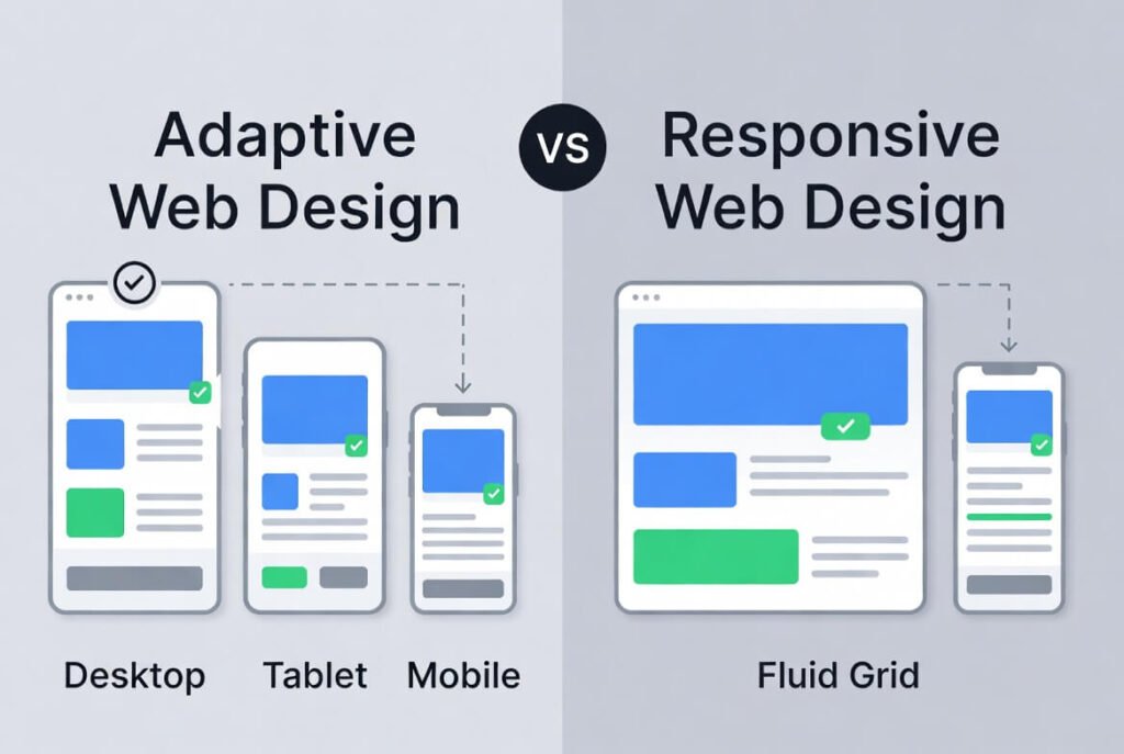
This illustration shows the difference between adaptive and responsive design, highlighting how responsive reflows content across devices.
Responsive Web Design Examples
Look at Apple’s site. It adjusts flawlessly from desktop display to mobile, with images scaling and menus collapsing.
Amazon uses responsive techniques for fast shopping on any device.
Our portfolio at Suncode Miami includes sites that shine on every screen. One client saw conversions rise 30% after going responsive.
These show how responsive design creates engaging experiences.
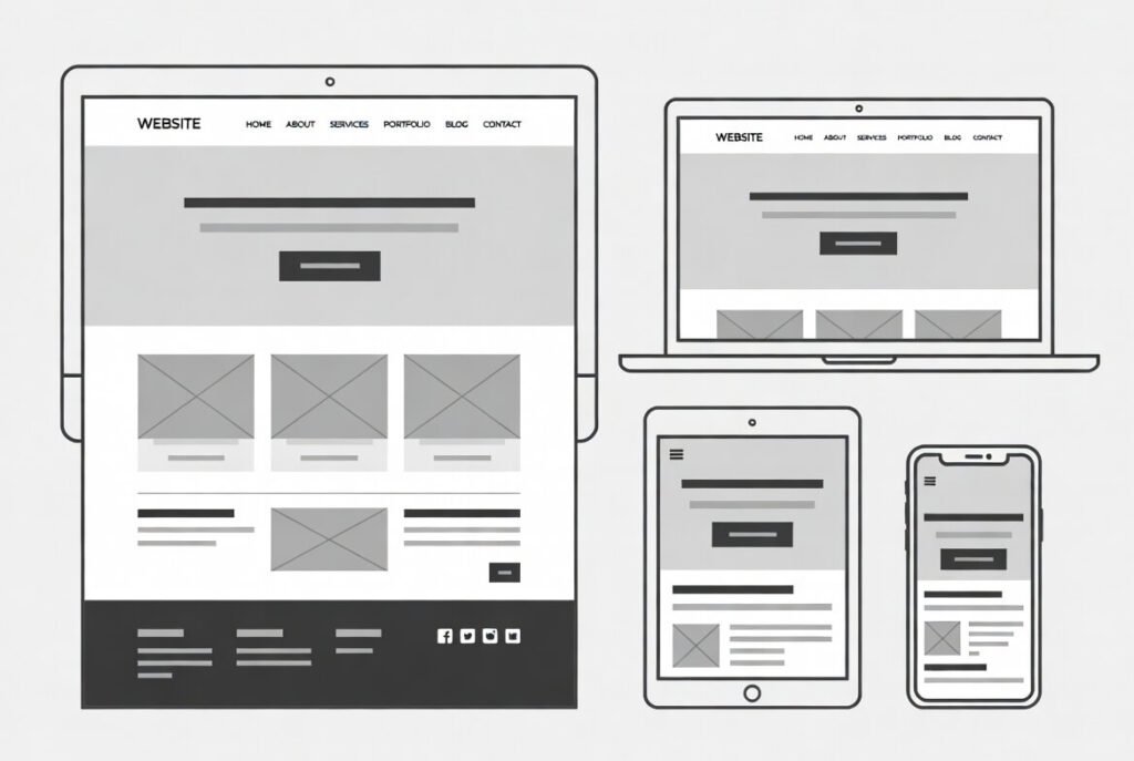
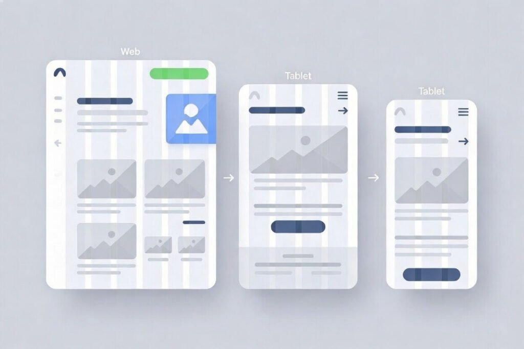
See how this design scales down from large monitors to small phones, maintaining structure and content.
FAQ
What is the difference between responsive and adaptive design?
Responsive uses fluid layouts that adjust continuously, while adaptive snaps to fixed designs at breakpoints. We prefer responsive for smoother transitions.
How do media queries work in responsive design?
Media queries apply CSS rules based on conditions like screen width. For example, they hide elements or change layouts at certain points.
Why is mobile-first design important?
It ensures the site works on small screens first, then enhances it for larger ones. This prioritizes core content and improves performance.
What are common breakpoints for responsive design?
Typical ones are 320px (mobile), 768px (tablet), 1024px (desktop). Adjust based on your content.
How does responsive design affect SEO?
Google favors mobile-friendly sites, so responsiveness improves rankings and user engagement.
Can I make an existing site responsive?
Yes, by adding media queries, fluid grids, and flexible images. We offer audits to help.
We hope this introduction to responsive web design sparks ideas for your site. At Suncode Miami, we specialize in creating responsive websites that drive results. Ready to elevate your online presence? Fill out our form for a free consultation on web design and marketing services.
For more basics, read our “What Is Web Design? 2026 Guide“

