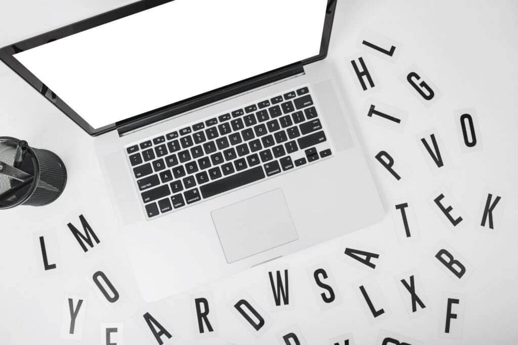
Typography trends in web design 2026 put font choices front and center in web design. We see brands moving away from safe, uniform looks toward styles that feel more personal and alive while still staying clear and fast-loading. These changes help your site grab attention quickly and communicate your key messages without making visitors work hard to read them.
Key Points / Quick Summary
• Bold, expressive fonts create immediate visual impact in hero sections and headlines.
• Variable fonts deliver flexibility and better website performance from a single font file.
• Serif fonts stage a noticeable comeback, adding warmth and authenticity.
• Nostalgic typography mixed with retro styles helps brands feel genuine and memorable.
• Dynamic and AI-generated options bring motion and uniqueness to interfaces.
• Thoughtful font pairings keep minimalist layouts readable on any screen size.
• These updates make typography more scalable and effective for digital platforms.
What Are the Top Typography Trends for the Year Ahead?
We have been watching typography evolve closely while helping entrepreneurs and business professionals refresh their online presence.
Here is what stands out most right now.
Trend 1: Bold and expressive font styles that deliver striking visual impact right away.
Trend 2: Variable fonts that adapt smoothly across devices.
Trend 3: Expressive serif fonts that bring back character and trust.
Trend 4: Nostalgic typography inspired by retro styles for a sense of authenticity.
Trend 5: Dynamic typography that adds gentle motion to engage users.
These directions give you practical ways to refresh your site without starting from scratch. We usually begin by reviewing what you already have in place.
Why Bold Typography Keeps Working So Well in 2026

Bold typography grabs attention because it turns simple headlines into strong statements. In our projects we often enlarge letterforms and use high-contrast weights on landing pages and hero sections. This approach helps key messages land faster, especially when attention spans feel shorter than ever. We like pairing these bold visual elements with clean sans-serif fonts for body text so the whole layout stays readable and professional. The result feels energetic without overwhelming your visitors.
How Variable Fonts Are Making Web Design Smarter and Faster
Variable fonts change the game by putting an entire range of weights and widths inside one single font file instead of loading multiple font files. This approach improves website performance noticeably and lets the typeface adjust dynamically based on screen size or context. We leverage variable fonts for clients who want their sites to feel fluid on phones, tablets, and desktops while keeping load times low. The technology ensures consistency across all touchpoints and makes it easier to create layouts that respond naturally.
Why Serif Fonts Are Making a Strong Comeback This Year
Serif fonts bring a sense of warmth and permanence that many sans-serif options miss. We are seeing high-contrast serif fonts work especially well for corporate branding, luxury fashion, and lifestyle brands that want to project quality and trust. When we pair them thoughtfully with minimalist layouts, the combination feels balanced and inviting. These fonts remain readable at every size, which matters a lot when people browse on different devices. In practice we always test them live to confirm they support your brand identity without sacrificing clarity.
How Nostalgic Typography and Retro Styles Can Strengthen Your Brand
Nostalgic typography draws from retro styles to create an emotional connection that feels familiar yet fresh. We blend elements like 1970s-inspired letterforms with modern shapes so the final look supports your visual identity without feeling stuck in the past. This style works particularly well for entrepreneurs and lifestyle brands that value authenticity. It helps enhance branding by reminding visitors of trusted qualities while still looking current in the coming year. We keep the application clean so the focus stays on your message.
What Role Do AI-Generated and Experimental Fonts Play Now?
AI-generated fonts let teams create unique typefaces tailored to specific needs, though we always add human review to protect brand impact. Experimental letterforms give your interface more personality and help it stand out. Creative agencies and business owners we work with appreciate how these options open new ways to shape and rhythm text. The important part is testing carefully so the font style supports readability instead of competing with it.
Why Anti-Design and Imperfect Typefaces Feel Refreshing
Anti-design approaches introduce small amounts of deliberate imperfection that make a site feel more honest and human. We use slightly raw letterforms or off-grid details to signal authenticity in a world full of overly polished digital platforms. This style pairs nicely with bold colors and helps brands communicate messages with a genuine voice. Many clients tell us it makes their websites feel approachable rather than distant. We balance the effect so users never lose their way.
How to Pair Fonts Thoughtfully for Better Results
Good font pairings start with a clear purpose. We usually choose one strong display font for headlines and a supporting sans-serif fonts option for longer text. The right combination creates natural rhythm that guides the eye and reinforces your aesthetics. We test pairings on real content and across devices to make sure everything stays visually appealing and readable. This step prevents common mistakes and helps every typeface contribute to your overall brand story.
Read: Web Fon Optimizations
Step-by-Step: Updating Your Site with 2026 Typography Trends
Follow this process we recommend to clients who want to refresh their typography thoughtfully.
1 – Review your brand identity and define the personality you want to convey through type.
2 – Choose a primary typeface for headlines and a complementary one for body text. Consider variable fonts for flexibility.
3 – Test pairings in real layouts across different screen sizes to ensure readability and visual balance.
4 – Apply hierarchy with appropriate sizes, weights, and spacing while keeping key messages clear.
5 – Incorporate subtle motion or dynamic adjustments where they enhance user experience without distracting.
6 – Check accessibility and performance. Optimize font files and verify contrast ratios.
7 – Gather feedback from real users and refine the system before full implementation.
This structured approach ensures your typography supports both aesthetics and functionality.
Why These Font Trends Matter for Your Business
From our experience working with business owners and entrepreneurs, the right typography styles do more than look good. They influence how quickly visitors trust your site and how long they stay. When fonts align with your message, your pages feel more memorable and supportive of your marketing goals. These updates also boost accessibility and performance, which helps your visibility and user satisfaction. We help clients move from basic setups to polished digital experiences that truly reflect who they are.
If you would like to explore the basics of good design further, take a look at our article on what web design is about. For visual inspiration you might also enjoy our notes on dark mode web design inspiration best practices
Frequently Asked Questions About Typography Trends 2026
What stands out most in font trends 2026? The biggest shift is toward flexible, personality-driven options that still prioritize readability and speed. Variable fonts and smart pairings lead the way.
Do I have to redesign everything to try these ideas? Not at all. Many wins come from updating hero sections or swapping in a better single font file. Start small and build from there.
Are serif fonts right for every business? They suit a wide range of industries when chosen and tested carefully. They add warmth that benefits corporate branding and lifestyle brands alike.
Will these trends slow down my website? Most actually help performance. Variable fonts replace multiple font files with one scalable solution, which often improves loading times.
Should we bring in outside help to apply these trends? It depends on your team’s bandwidth. Working with specialists makes it easier to integrate dynamic typography while keeping everything consistent across your touchpoints.
Learn about What Is Web Design? 2026 Guide
We hope this gives you a clear picture of what is possible in the year ahead. If you are thinking about refreshing your site to better reflect your brand, we are here to help. Reach out and let’s talk about what would work best for your business.

