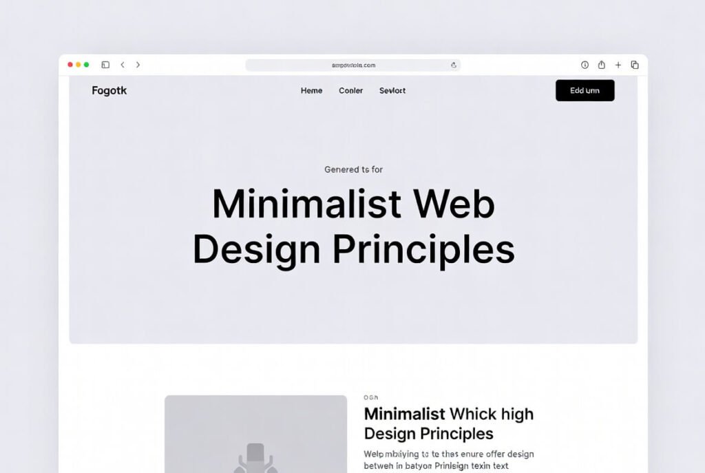
Minimalist web design principles cut out the extras to zero in on what really matters, resulting in sharp, distraction-free interfaces that put the user first. This style leans hard into simplicity, with just a few colors, plenty of breathing room, and straightforward type that helps people move around easily. Here at Suncode Miami, we treat it as the smart path to fast-loading pages that keep visitors hooked without any fluff.
Here’s why it matters so much for business owners and entrepreneurs. It makes sites easier to use, speeds up load times, and matches the sharp, no-nonsense look that busy professionals want online. We focus on turning these concepts into real websites that get results, like more people filling out forms to reach our web design and marketing services.
Key Points / Quick Summary
• Stick to the must-have features to ditch clutter and visual noise.
• Stick with a small set of colors to keep everything looking unified.
• Add plenty of negative space or white space to improve flow and steer attention where it belongs.
• Go for clean typography-usually sans-serif fonts-so everything reads well on any screen.
• Build it responsive right from the start so it works smoothly everywhere.
• Put the most critical stuff front and center without piling on fancy extras.
What Are Minimalist Web Design Principles?
Minimalist web design boils down to keeping things stripped back, ditching anything that isn’t needed so the important content stands out. Picture it as peeling off the layers until only what’s useful remains to get your point across clearly. The whole idea puts real function ahead of showy touches, making sure each button, typeface, or search field actually does something worthwhile.
Over more than ten years at Suncode Miami, we’ve built tons of these sites for professionals and business folks. We start from the understanding that minimalist website design goes way beyond a passing fad-it’s a solid plan to strengthen how people see you online. Take a typical minimalist site: it often has a straightforward menu that doesn’t bombard you, guiding visitors right to the good stuff. That setup keeps things quick to load and just plain nice to look at.
Put it like this. In our day-to-day work, clients show up wanting websites that grab attention without feeling crowded. Minimalist principles nail that by keeping messages short and the look simple. It pulls straight from core graphic design rules-fewer things on screen mean less to distract from your main point, whether that’s your brand story or a clear next step.
Why Do Businesses Benefit from Minimalist Design?
Companies see real advantages because it sharpens the experience for visitors and makes the site run smoother overall. People hang around longer on pages that load quickly and feel straightforward, which often translates to more inquiries and actual leads. On top of that, search engines tend to reward clean, mobile-ready setups.
From where we sit at Suncode Miami, rolling out these ideas turns your website into something that actually helps you grow. Entrepreneurs and pros are already handling a million things, so why let the site add more chaos? It spotlights the important bits-like contact forms-so it’s simpler to guide people toward what we offer in marketing services.
Here’s the real payoff. A tidy layout cuts down on people leaving right away and gets them more involved. We’ve watched client sites jump in performance once we apply this thinking, turning window-shoppers into solid contacts. It fits right into today’s preference for designs that look good and actually work well.
What Are the Key Principles of Minimalist Web Design?
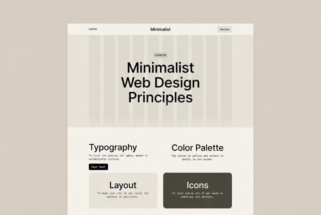
The main ideas circle around keeping it simple, staying focused, and working efficiently. These rules help designers create sites that deliver without going overboard. At heart, minimalist web design principles come down to smart use of space and picking only the pieces that add value instead of getting in the way.
We see these fundamentals as lasting ones. They deliver a consistent feel that holds up on phones, tablets, or desktops. Let’s go through them one by one.
Principle #1: Embrace Simplicity in Design
Kick things off by committing to simplicity so the whole foundation supports only what’s truly needed. That means highlighting core features while dropping anything extra, ending up with a clean layout that’s a breeze to move through.
When we start a project at Suncode Miami, the first question is always: what does this site actually require? A typical business page might just need a home section, services overview, and a way to get in touch. That keeps things uncluttered and makes every decision tie back to helping the visitor.
Digging a bit deeper, going simple speeds up loading and makes everything more user-friendly. It avoids busy visuals with crisp lines, so the site feels welcoming right away.
Principle #2: Use Ample White Space
White space, or negative space, matters because it lets elements stand out and naturally pulls the eye to what counts. It opens up the page and helps visitors follow along without feeling crowded.
After years doing this, we’ve learned that generous spacing stops people from getting overwhelmed. On a site like ours, it could mean giving testimonials or service details some room so the key messages hit harder.
From there, you place important calls-to-action or headlines in those open areas. It cuts the noise and zeros in on what really drives results.
Principle #3: Limit Your Color Palette
Sticking to just a handful of colors keeps the design tight and stops it from feeling chaotic. Usually 2-3 shades-often built around neutrals-give a fresh, modern vibe that lets content shine.
We suggest beginning with calm base tones and picking one punchy accent for buttons or links. Fewer colors help keep the site snappy since there’s less to load.
That’s why it clicks. It ties everything together visually and makes moving around feel instinctive. For minimalist sites, this is one of the biggest ways to stay sharp and professional.
Click here to learn more on Color Theory in Web Design
Principle #4: Prioritize Typography
In minimalist setups, type becomes the star-clean sans-serif choices create clear order and make reading effortless, no matter the device.
At Suncode Miami, we pick fonts that match the brand’s personality. Something straightforward like Helvetica lets words stand out without needing bells and whistles.
Think about what it does. Strong type leads the eye, builds hierarchy, and keeps content easy to skim quickly.
Principle #5: Focus on Functionality and Usability
The site has to work smoothly, with navigation, buttons, and icons all backing up what the user wants to do. That keeps people interested and moving forward.
We test rigorously to make sure. A search field, for example, should be easy to spot but never steal the show-that fits the minimalist mindset perfectly.
This pulls all the pieces together, making sure the design serves real engagement without extra decoration.
How to Implement Minimalist Web Design: Step-by-Step Guide
Ready to put it into action? This is the clear process we follow at Suncode Miami when building these kinds of sites.
Step 1: Pinpoint the core features and cut everything else. Figure out exactly what the site needs to do for your visitors.
Step 2: Set up a grid for structure, weaving in white space and a tight color range.
Step 3: Choose typography and elements. Pick simple sans-serif typefaces and sharp images that back up your message.
Step 4: Build navigation. Keep it basic-maybe even a tucked-away menu if it suits-but always make it intuitive.
Step 5: Optimize for devices. Build responsive so it shifts naturally to fit any screen.
Step 6: Test and refine. un checks on speed and ease of use, then strip out whatever still feels off.
This method leads to sharp, high-performing sites that convert well.
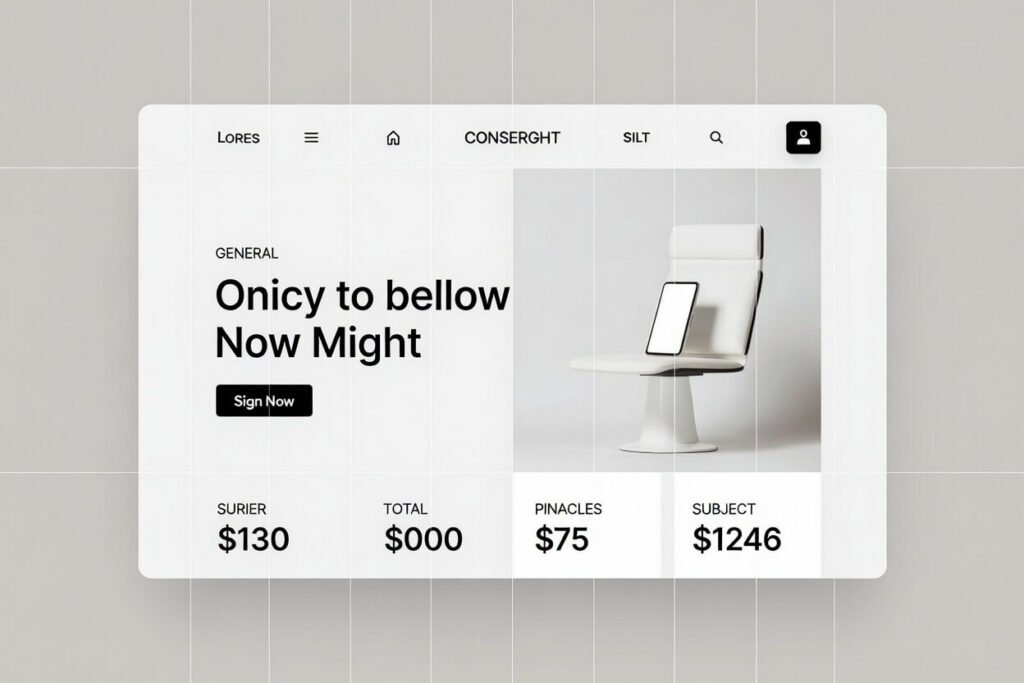
What Are Some Examples of Minimalist Website Design?
Real-world minimalist websites bring these ideas to life clearly. Google’s homepage is the classic: basically just a logo and search box, nothing more-pure focus on the task.

Apple’s site does the same with lots of open space and restrained colors to spotlight products. These standouts keep inspiring what we create at Suncode Miami.
For business pages, look at clean portfolios that rely on flat design and basic type. They prove you can look polished and stay highly usable at the same time.
What Challenges Come with Implementing Minimalist Design?
One common snag is ending up too sparse, where the site feels empty or unfinished. It’s tempting to remove too much and accidentally hide important ways to navigate.
We handle that through actual user testing. The goal is keeping it intuitive even while staying true to the minimalist rules.
Another tricky part is finding the sweet spot between looking good and working well. Every piece has to pull its weight without crowding the page.
FAQ
What is the main benefit of minimalist web design?
Faster loads and smoother navigation that keep visitors engaged longer and more likely to stick around.
How does minimalist design affect site performance?
It lightens the page by removing extras, so everything loads quicker and responds better on any device.
Can minimalist design work for complex businesses?
Absolutely-by smartly organizing hierarchy and highlighting what’s key, even intricate offerings can feel clean and approachable.
What tools help with minimalist web design?
Figma handles layouts nicely, and Google Fonts offers plenty of clean type options to get started easily.
Why choose Suncode Miami for minimalist designs?
We’ve got over a decade delivering fresh web solutions, creating sites that lift your brand and turn visitors into real opportunities.

