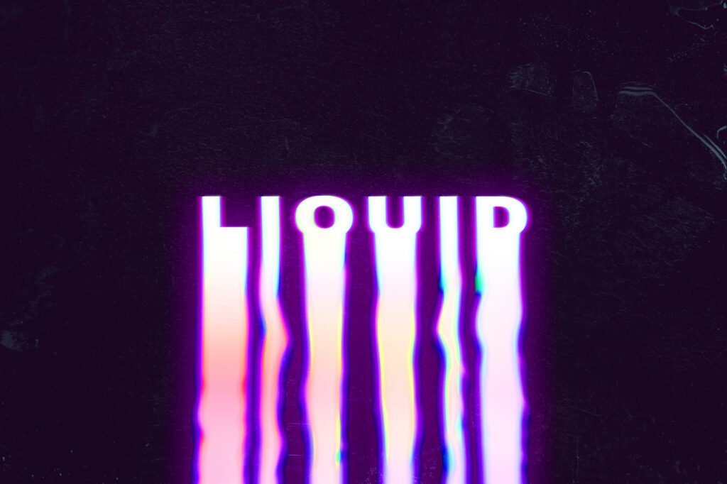
Kinetic typography in web design is the art of bringing text to life through thoughtful animation and motion. Instead of static words on a page, letters and phrases move, transform, or respond as users scroll or interact, creating a more dynamic and engaging experience.
We at Suncode Miami have been using kinetic typography in many client projects for over ten years. When done with care, it helps guide the user’s eye, highlights key messages, and makes websites feel more alive and modern. The goal is never to distract, but to enhance the overall user experience and make content more memorable and digestible.
Key Points / Quick Summary
Kinetic typography uses animation to add visual interest and emotional impact. It can make text fade in, morph, shrink, or move with purpose as users scroll or hover, turning ordinary text elements into something more expressive and captivating.
The role of kinetic typography is to improve visual hierarchy and draw attention to important information without overwhelming the reader. When paired with good typography and clean layouts, it creates a more immersive and enjoyable browsing experience.
Modern implementations rely on CSS animations, JavaScript, or scroll-triggered effects that remain smooth and performant, even on mobile devices. Subtle movement is usually more effective than flashy effects.
Benefits include higher user engagement, better readability of key messages, and stronger emotional connection with the brand. It helps turn static content into something that feels dynamic and purposeful.
The key to success is moderation. Overuse can hurt accessibility, reduce legibility, or create motion fatigue. The best kinetic typography supports the core message and enhances the overall user interface rather than competing with it.
Introduction: The Dynamic World of Kinetic Typography in UX
What is kinetic typography and why is it gaining popularity in web design?
Kinetic typography, also known as motion typography or typography in motion, is the technique of animating text to create visual interest and guide the audience’s attention. It goes beyond static fonts by adding movement, transitions, and timing that make words feel alive on the screen.
Designers use kinetic typography to highlight key messages, create visual hierarchy, and make long blocks of text feel more digestible. It’s especially effective in hero sections, landing pages, and storytelling experiences where you want to captivate visitors from the first moment.
The popularity of kinetic typography in web design comes from its ability to add personality and energy without requiring heavy graphics or video. When used thoughtfully, it makes websites feel more modern, expressive, and engaging while still maintaining excellent readability and professionalism.
Read: Typography Trends 2026: Font Styles Shaping Web Design
The Importance of Kinetic Typography in Modern UX Design
How does kinetic typography improve user experience and UI design?
Good kinetic typography plays an important role in enhancing user experience by making interfaces feel more responsive and alive. As users scroll or interact, animated text can softly fade in, transform, or move with purpose to direct attention exactly where it’s needed.
It helps break up long blocks of text and makes content easier to scan. Well-designed animations can underscore important points, evoke emotion, and create a sense of progression as the user moves through the page.
In user interface design, kinetic typography works best when it supports the overall layout rather than fighting against it. Subtle text animations paired with clean typography and strong visual hierarchy create interfaces that feel both professional and delightful. The result is a more cohesive and engaging digital experience that keeps users interested and helps them understand the core message faster.
What are the main types and trends of kinetic typography in 2026?
In 2026, kinetic typography trends lean toward purposeful and restrained movement rather than flashy effects. Popular approaches include soft fade-ins, gentle morphing between words, and scroll-triggered animations that reveal text sequentially as the user moves down the page.
Many designers are combining kinetic typography with expressive serif or sans-serif fonts to create striking visual impact while maintaining legibility. Some trends also explore dynamic text animations that respond to cursor movement or device orientation for more interactive design.
Another growing direction is using kinetic typography throughout a website in a consistent way – for example, animating headings and key phrases to create a unified, modern aesthetic. The best implementations always prioritize readability and accessibility, ensuring that motion enhances rather than hinders the user experience.
How can you effectively use kinetic typography on your website?
The secret to successful kinetic typography is using it with purpose and moderation. Start by identifying the key messages you want to highlight and the emotional tone you want to convey. Then choose animations that support those goals without distracting from the content.
For example, you can use kinetic typography to highlight key messages in hero sections or to make call-to-action buttons more noticeable. In educational content or long-form articles, subtle animations can help break up text and make complex information feel more approachable.
Always test animations on different devices and with real users. Pay special attention to pace – animations that are too fast can feel chaotic, while ones that are too slow can feel boring. The right balance creates a powerful tool that enhances both aesthetics and usability.
Lear about Web Font Optimization
Step-by-step: How to implement kinetic typography on your site
Here’s a practical step-by-step guide we often share with clients who want to add kinetic typography:
1 – Define your goals. Decide which text elements need emphasis and what feeling you want to create (professional, energetic, calm, etc.).
2 – Choose the right font. The base typeface should be legible and expressive. Great typography is the foundation of any successful kinetic effect.
3 – Plan the animations. Start simple – soft fade-ins, gentle scale changes, or sequential reveals often work best.
4 – Build with CSS or JavaScript. Use modern scroll-driven animations or intersection observers for smooth, performant results.
5 – Test for readability and accessibility. Ensure text remains easy to read and provide options to reduce motion for sensitive users.
6 – Optimize performance. Keep animations lightweight so they don’t slow down the page, especially on mobile devices.
7 – Review and refine. Gather feedback from real users and adjust timing, pace, and intricacy until the motion feels natural and purposeful.
This approach helps you create kinetic typography that enhances the overall user experience rather than competing with it.
FAQ
What is the main benefit of kinetic typography in web design? It adds visual interest, guides the user’s eye, and makes key messages more memorable while improving engagement.
Does kinetic typography work well on mobile devices? Yes, when designed carefully. Subtle animations that are not too fast or complex usually perform well across screen sizes.
Can too much kinetic typography hurt user experience? Absolutely. Overuse can reduce readability, cause motion fatigue, or distract from the content. Moderation is essential.
Do I need advanced coding skills to add kinetic typography? Not necessarily. Many modern CSS techniques and no-code tools make it accessible, though custom JavaScript offers more control.
How do I ensure kinetic typography remains accessible? Provide reduced motion options, maintain good contrast, and test with real users who may be sensitive to movement.
Is kinetic typography still a relevant trend in 2026? Yes. When used purposefully, it continues to be a powerful tool for creating engaging, modern interfaces that capture attention and enhance branding.
Kinetic typography in web design is a wonderful way to bring energy and personality to digital experiences. When applied with care and purpose, it helps create websites that not only look beautiful but also communicate more effectively and leave a lasting impression on visitors.
At Suncode Miami we love combining kinetic typography with strong typography fundamentals and thoughtful user experience design. The result is websites that feel modern, engaging, and truly effective for business goals. If you’d like to explore more about web design fundamentals, see our guide on what is web design. For practical development advice, check web development where to start. You can also learn about our full services in what are web development services.
Ready to bring more motion and life to your website? We’d be happy to help. Fill out the contact form and let’s discuss how we can create something engaging and effective for your audience.

