We know choosing between Flat Design and Material Design can feel tricky, especially if you’re a business owner aiming to create a website or app that attracts entrepreneurs, professionals, or high-end clients. Over our decade-plus of experience in the field, we’ve built countless high-quality web and mobile projects using both approaches successfully. Flat design simplifies visuals to focus purely on content, cutting out extras like gradients, textures, skeuomorphic elements, or heavy shadows, resulting in extremely fast-loading, scalable, and distraction-free experiences.
Material Design, originally launched by Google and continually refined (now in Material 3 / Material You), builds directly on flat foundations but deliberately reintroduces subtle real-world physics-elements behave like layered pieces of paper with cast shadows, they respond to touch with ripples and smooth transitions, and the hierarchy guides the eye naturally. This makes it particularly powerful for apps and platforms where user flow, frequent interactions, and intuitive navigation are critical.
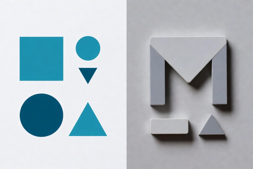
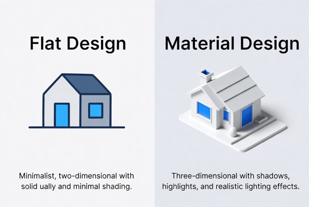
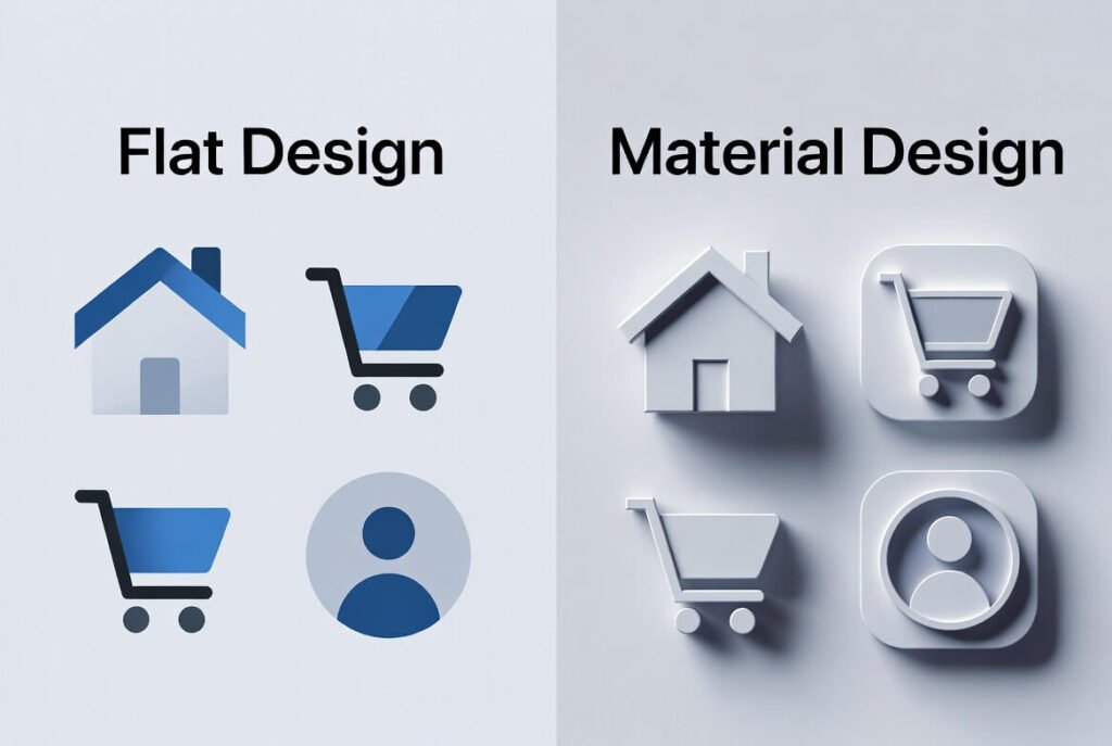
Flat design vs Material Design boils down to simplicity against subtle depth. Flat keeps things 2D and minimalist for speed and clarity, while Material adds layers-like realistic shadows, motion, elevation, and responsive interactions-to make interfaces feel more intuitive, tactile, and human-centered. Let’s break it down clearly so you can pick what’s right for your project.
Key Points / Quick Summary
• Flat design uses bold colors, clean typography, and no depth for fast-loading, minimalist UIs.
• Material design introduces the z-axis with shadows and animations for hierarchy and clickability.
• Both stem from rejecting skeuomorphic design, but material adds back subtle realism.
• Flat shines in web design for speed; material excels in mobile app design for usability.
• Pros of flat: Quick to build, responsive. Cons: Can confuse users on what’s clickable.
• Pros of material: Intuitive, consistent guidelines. Cons: More complex to implement.
• Choose based on your audience – simple for broad reach, layered for engaging experiences.
What Is Flat Design?
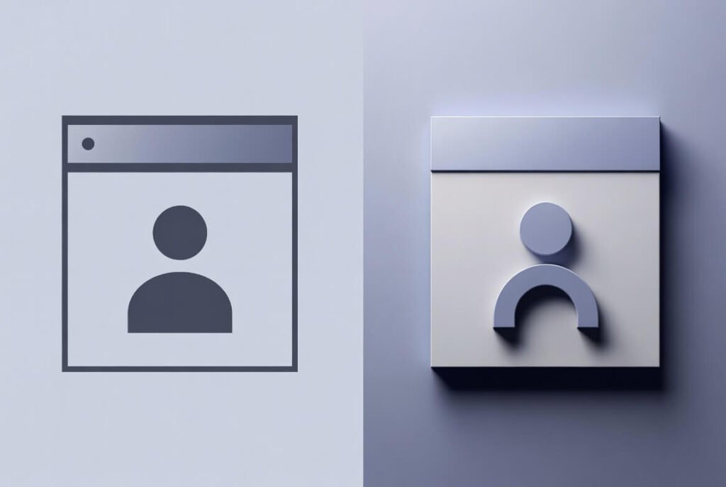
Flat design is a design style that strips away 3D effects for a clean, 2D look. It focuses on bold colors, simple icons, and clear typography to make interfaces load fast and feel modern. We often turn to it for websites where speed matters most.
Let’s look at its roots. Flat design grew out of trends like minimalism and the Swiss Style from the 1920s. It hit big in the 2010s when Microsoft and Apple ditched skeuomorphism – those realistic icons mimicking the physical world, like a trash can for delete. Instead, flat design uses flat colors and shapes to keep things efficient. Here’s why that shift happened: Older designs cluttered screens and slowed load times on mobile devices. Flat fixed that.
In practice, flat design elements include sharp edges, no gradients, and a minimalist approach. Think of it as a design trend that prioritizes function over flair. For example, in UI design, buttons are just colored rectangles – no shadows to make them pop. This makes flat design ideal for web design where you want quick navigation.
Learn more about Web Design in 2026 here!
What Are the Advantages of Flat Design?
Flat design offers real perks for business sites. First, it cuts load time significantly since there are fewer complex elements-like gradients, textures, or heavy shadows-to render. We’ve seen sites load 20-30% faster with this style in real projects, which directly helps reduce bounce rates and keeps visitors engaged longer, especially on mobile connections or slower networks. Next, it’s highly responsive and scales effortlessly across devices-Android, iOS, desktops-without losing sharpness or requiring extra optimizations, making it ideal for cross-platform business presence.
Usability gets a strong boost in simpler setups too. With minimal distractions, users zero in on the core content, messaging, calls-to-action, or key information, leading to clearer focus and often higher conversion potential. Plus, maintaining consistency becomes much easier across apps, websites, landing pages, or marketing materials-no worrying about mismatched shadows or effects. We recommend flat design when your primary goal is a clean, professional, distraction-free user experience without unnecessary bells and whistles, particularly for corporate sites, SaaS tools, portfolios, blogs, or brands emphasizing modernity and efficiency.
What Are the Disadvantages of Flat Design? Flat design isn’t perfect for every scenario. One big issue is clickability-without shadows, elevation, or depth cues, users (especially on first glance or across age groups) might not immediately spot interactive elements like buttons, links, or cards, leading to hesitation or missed actions. We’ve fixed this successfully in many projects by adding subtle borders, color contrasts, underlines on hover, or minimal outlines to provide clear affordances without breaking the flat aesthetic.
Another downside: It can feel too generic. Flat design may lack personality, making your site blend in. Also, for complex interfaces, it falls short on guiding users through layers. That’s where material steps in.
What Is Material Design?
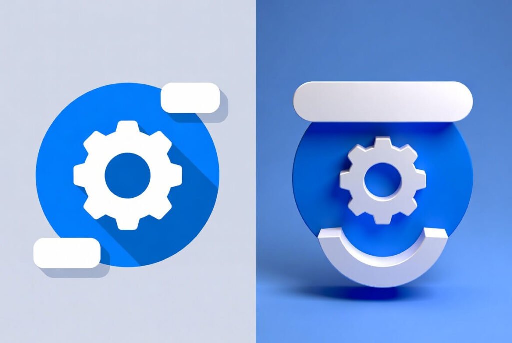
Material design is Google’s design language, a set of guidelines that builds on flat but adds depth. It treats the screen like paper, using the z-axis for shadows and layers to show what’s important. This makes interfaces feel tactile and natural.
Google’s material design launched in 2014 to unify Android apps. It was introduced as a way to make designs consistent across mobile devices. The idea of material design draws from the physical world, like how light hits paper, but keeps things digital. Material design guidelines cover everything from colors to animations.
In app design, material uses bold colors too, but with motion – elements expand or shift smoothly. This design system helps create a visual language that’s intuitive. For instance, cards stack like real ones, casting shadows for depth.
What Are the Advantages and Disadvantages of Material Design?
Material design takes flat’s strengths and improves them. Advantages include better hierarchy – shadows show what’s on top, aiding usability. Animations provide feedback, like a button rippling on tap. It’s great for android operating system consistency. On the flip side, disadvantage comes from complexity. Material design also demands more resources, potentially slowing load times. But in our experience, the trade-off pays off for engaging UX design.
How Do Flat Design and Material Design Differ in Functionality?
Flat and Material Design tackle functionality differently. Flat design keeps everything strictly on one plane-no use of the z-axis or depth-so it’s simpler and more straightforward, but this can sometimes confuse users about what’s clickable or interactive. Material Design, by contrast, deliberately uses shadows, elevation on the z-axis, and layered elements to highlight hierarchy and interactions, making navigation feel more natural and predictable.
Here’s why this matters in practice: In flat design, elements rely almost entirely on color, spacing, size, typography, and positioning alone to communicate affordance (what can be clicked, tapped, or interacted with). Without visual depth cues, users-especially newcomers or on quick scans-may hesitate or miss buttons, cards, or links, requiring careful design choices like strong contrast, hover states, or subtle underlines to compensate.
Material Design adds motion and physical metaphors: when you tap a button, it ripples; cards lift slightly on hover or press; floating action buttons rise above the content. These responsive animations and shadows provide instant feedback, mimic real-world behavior (like paper or ink responding to touch), and guide the eye through priorities and flows more intuitively. The result is often faster task completion, fewer errors, and a more satisfying experience, particularly in apps with frequent interactions, forms, menus, or complex workflows.
How Do Their Aesthetics Compare?
Aesthetics in flat design lean minimalist – think clean lines, no extras. Flat design tends to use limited palettes for a calm feel. Material style brings in gradients and shadows for depth, creating a more dynamic look.
We see flat as a minimalist approach that’s timeless. Material, though, feels modern with its design as well – bolder and layered. Both avoid skeuomorphic clutter, but material imitates the real world subtly.
What About Inspiration and Ease of Design? Flat draws from art movements like Bauhaus, focusing on form follows function. It’s easy to start – no strict rules. Material’s inspiration? Paper and ink, with Google’s strict guidelines for consistency.
Ease-wise, flat design simplifies creation since it doesn’t need animations. Material design takes more planning but offers templates. If you want to design fast, go flat; for structured, use material.
How to Choose Between Flat and Material Design: Step-by-Step Guide Deciding? Follow these steps we’ve honed over years.
● Step 1: Assess your project. For web design targeting business professionals, check if speed or interaction is key. Flat for simple sites, material for apps.
● Step 2: Consider audience. Entrepreneurs on mobile? Material’s intuitiveness wins. Broader web users? Flat’s minimalism avoids overload.
● Step 3: Review resources. Flat is quicker to build; material has ready guidelines from Google material design.
● Step 4: Test usability. Prototype both – see what feels right. We’ve done this to funnel users toward conversions like form submissions.
● Step 5: Align with brand. If your visual language is clean, flat fits. For depth, choose material.
This process ensures your choice boosts user experience and drives goals.
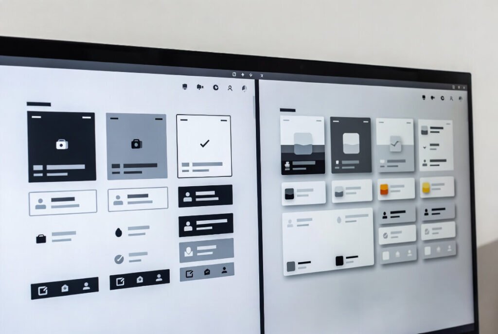
Flat Design vs Material Design in Practice We’ve applied both in real projects. Flat design principles work well for static sites – think a business homepage with quick info. It uses flat design to keep aesthetics simple. Material, though, elevates android apps. Google’s material adds animations for smooth transitions, making apps and websites more engaging.
Trend in design shows material evolving, like Material 3 with more personalization. Flat design’s still strong for graphic design basics.
Deeper Dives: Skeuomorphism and Beyond Skeuomorphic design once ruled, imitating real objects. Flat rebelled against it for speed. Material bridges them – not fully skeuomorphic but adds realism.
In interface design, flat design doesn’t use depth, while material does. This makes material an excellent choice for complex UIs.
For mobile app development, material design is an excellent pick. It handles difficult to use scenarios better than pure flat.
Flat and Material: Blending for Modern Needs Like flat design, material keeps things clean. But material design takes a step further with layers. We’ve blended them in web and mobile projects – flat for backgrounds, material for buttons.
Two design styles offer flexibility. Flat design vs material design isn’t a war; it’s about fit.
Learn more about web design trends here.
FAQ Section What is the main difference between flat design and material design? Flat is purely 2D and minimalist; material adds shadows and animations for depth.
1 – Is material design better than flat design? It depends – material for intuition, flat for speed. Both have places.
2- Can I use flat design in Android apps? Yes, but material aligns better with Google’s standards.
3 – What are the design practices for material? Follow Google’s guidelines for consistency in colors, icons, and motion.
4 – Why choose between flat and material design? To match user needs – simple vs interactive.

