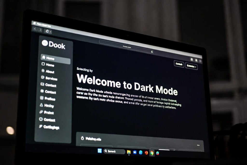
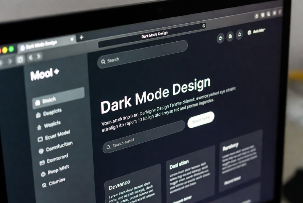
Dark mode web design flips the traditional layout of light backgrounds and dark text into a darker interface with lighter elements. The result is a visual style that feels easier on the eyes, especially in low-light environments. Rather than simply changing colors, dark mode focuses on creating themes that reduce glare while maintaining usability, readability, and visual appeal. This design approach has grown rapidly in popularity because it matches how people actually use devices today.
Let’s explore this a bit further. Over the past 10+ years working on web development projects, we’ve watched dark mode evolve from a small feature into something many users actively expect. It originally appeared in tools like reading apps and code editors, where long screen sessions made eye comfort a priority. Today, it’s everywhere-from social media platforms to corporate websites. The real challenge is finding the right balance between aesthetics and usability so your website still feels modern, polished, and easy to navigate.
Key Points / Quick Summary
• Reduces eye strain by minimizing bright light, making it ideal for browsing at night.
• Can improve battery life on OLED screens since darker pixels consume less energy.
• Improves accessibility for users with light sensitivity or certain visual conditions.
• Creates a sleek, modern look that can help brands feel more innovative.
• Requires thoughtful color selection to maintain strong readability.
• Can be implemented using CSS techniques such as media queries.
• Increasingly common across industries, from technology platforms to creative portfolios.
What exactly is dark mode in web design?
It’s a user interface where the background is dark, like deep gray or black, and text or icons are light colorDark mode is a user interface style where the background uses dark tones-often deep gray or black-while text, icons, and key elements appear in lighter colors. In many ways, it functions like a “night mode” for websites. Traditional light mode mimics printed paper with dark text on white, but dark mode aligns more naturally with how digital screens behave in dim environments.
In many of the sites we’ve built for clients, adding dark mode has had a noticeable impact. Visitors often stay on the page longer and report that the browsing experience feels more comfortable, particularly during evening use.
Why implement dark mode?
The main reason is simple: users appreciate having options.
When people browse in darker environments, bright websites can feel harsh-almost like looking directly into a flashlight. Dark mode softens that effect by lowering glare and reducing exposure to intense light. It can also help minimize blue light exposure, which many users associate with better sleep habits.
From a business perspective, implementing dark mode also signals that your site is keeping up with modern design trends. Offering this option can improve user engagement and create a more personalized browsing experience.
If you’re considering implementing dark mode, start with a quick design audit. Review your existing color palette and identify the elements that will require adjustments-buttons, links, background layers, and interface components. This initial step helps ensure the transition between light and dark themes feels seamless.
What Are the Main Benefits of Dark Mode Web Design?
Based on our experience working on multiple projects, the advantages of dark mode add up quickly.
Reduced Eye Strain
Spending long hours looking at screens naturally leads to eye fatigue. A darker background combined with lighter text can make extended reading sessions feel more comfortable. In low-light environments-like evening browsing-this setup reduces the harsh contrast that often causes visual strain.
Improved Battery Efficiency
On devices with OLED or AMOLED isplays, dark mode can also help conserve battery power. When screens display pure black, many pixels actually turn off completely, which reduces power consumption. Some clients have reported that users browsing their mobile sites spend more time exploring content without worrying about battery drain.
Better Accessibility
Dark mode can also improve accessibility. People who experience light sensitivity, migraines, or photophobia often struggle with bright interfaces. A properly designed dark theme can make your site more inclusive while still maintaining clear contrast levels aligned with accessibility guidelines.
Stronger Visual Identity
From a visual standpoint, dark interfaces often feel sleek and immersive. They work especially well for creative portfolios, technology brands, or product showcases. When vibrant accent colors appear against dark backgrounds, they naturally stand out and guide the user’s attention toward important elements like calls-to-action.
Increased Engagement
Comfort matters. When users feel comfortable browsing a site, they’re more likely to stay longer and explore additional pages. In several projects where we introduced a light/dark toggle, bounce rates dropped while time-on-site increased.
What Challenges Come with Implementing Dark Mode?
While dark mode offers many benefits, it also introduces some design challenges.
Readability Issues
If contrast levels are not properly calibrated, text can become difficult to read. This is particularly important for users with low vision. A good rule of thumb is maintaining at least a 4.5:1 contrast ratio for body text. Testing tools can help simulate different viewing conditions to ensure readability remains consistent.
Image Adjustments
Images and graphics often require modifications as well. Bright images placed on dark backgrounds may appear overly harsh. Designers frequently adjust brightness levels, add subtle borders, or tweak opacity so visuals integrate naturally with the overall design.
Brand Consistency
Brands with very bright color palettes sometimes struggle when introducing dark themes. Instead of simply inverting colors, the palette must be adapted carefully so the brand identity remains recognizable across both light and dark modes.
Additional Development Time
Supporting two visual themes inevitably increases testing and development time. However, modern techniques such as CSS variables make managing multiple themes much easier than it used to be.
Bright Environment Usability
Dark mode can sometimes be harder to read outdoors or in bright environments. For this reason, offering a toggle option-allowing users to switch between light and dark-is typically the best approach.
How Does Dark Mode Affect User Experience?
Dark mode can significantly improve comfort during browsing, particularly in low-light environments such as evenings or dimly lit rooms. By reducing glare, it allows users to read and focus on content for longer periods without discomfort.
Beyond comfort, dark interfaces also create a modern and polished aesthetic. Many high-end apps and platforms use dark themes to convey a premium feel, which can positively influence how users perceive a brand.
Well-designed dark mode interfaces also highlight interactive elements more effectively. Buttons, forms, and cards can stand out through subtle contrast or soft gradients, guiding users through the page naturally.
That said, performance can vary depending on the audience and context. For heavy reading or brightly lit environments, traditional light mode may still perform better. This is why offering both options often delivers the best results.
On mobile devices, dark mode is particularly popular because many users switch to it at night for comfort. Providing this option-or automatically matching system preferences-demonstrates attention to user experience and can strengthen brand loyalty.
You might be interested in Web Development in 2026!
What Are Some Inspiring Examples of Dark Mode Websites?
Several well-known platforms showcase how effective dark mode design can be.
Apple’s website often uses dark themes to highlight products with dramatic contrast and rich imagery. The result feels immersive and futuristic.
Spotify takes a similar approach with its interface, using dark backgrounds combined with vibrant accent colors for playlists and music categories.
GitHub focuses on minimalism. Its dark gray interface allows developers to read and edit code for long periods without visual fatigue.
Creative platforms like Behance frequently use dark backgrounds to allow visual work to stand out without distraction.
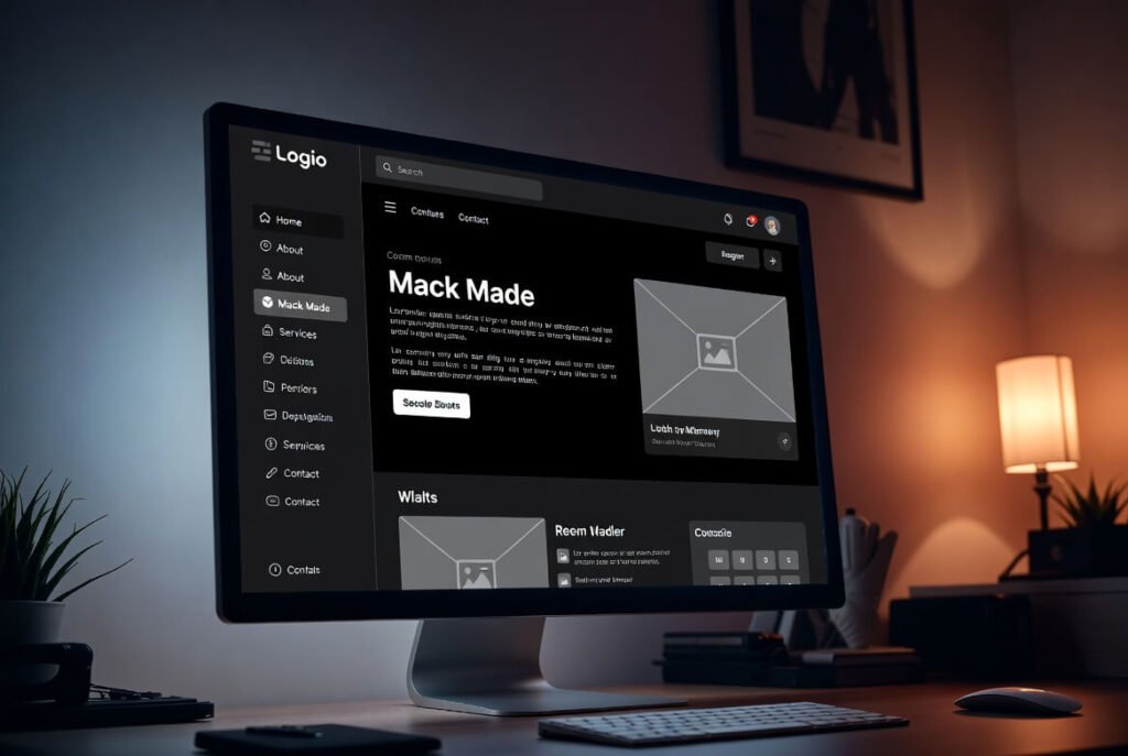
In our own projects, we’ve drawn inspiration from many of these examples. In one client portfolio redesign, introducing dark mode transformed a basic website into something much more stylish and cohesive.
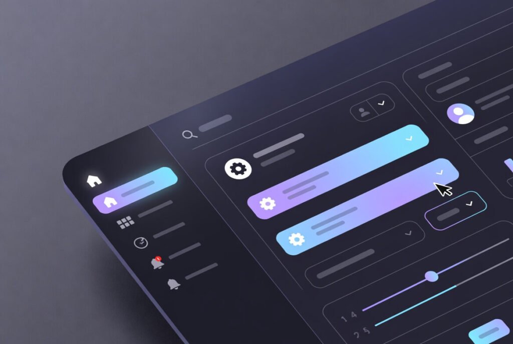
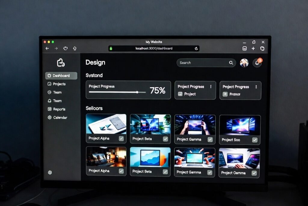
This example shows a modern dark theme with gradients and interactive elements – great for tech sites, where subtle animations add dynamism and guide user attention effectively.
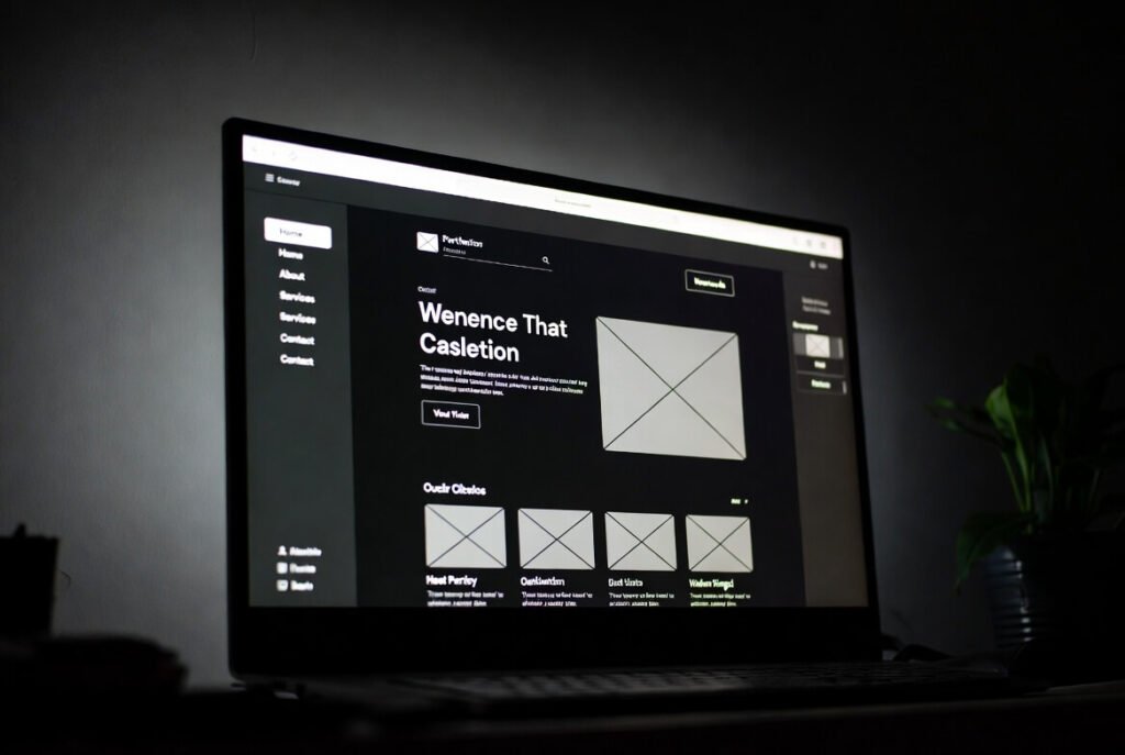
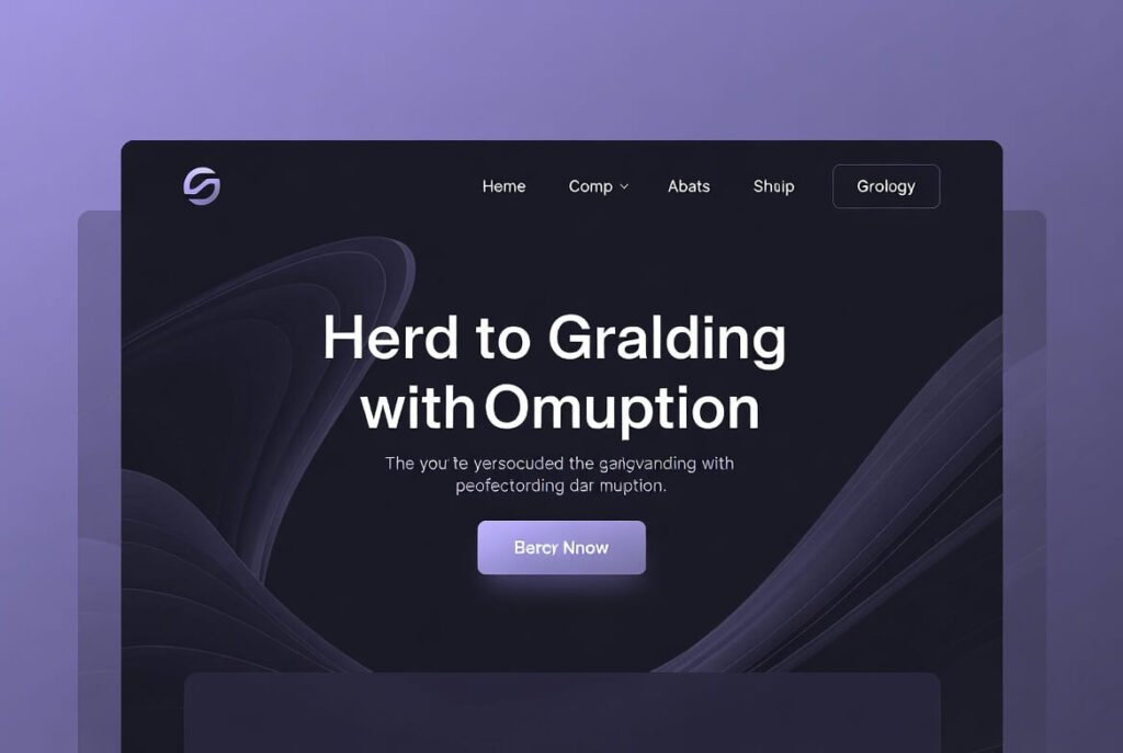
Here’s a landing page in dark mode, using opacity for depth and purple accents for harmony, which creates a balanced visual flow that feels both professional and inviting to potential customers.
How Do You Choose the Right Color Palette for Dark Mode?
Selecting the right color palette is essential for a successful dark theme.
● Start with dark backgrounds-often dark gray rather than pure black-to avoid harsh contrast.
● Use soft off-white or light gray tones for body text.
● Adjust accent colors so they remain visible without appearing overly bright.
● Test combinations using contrast tools such as Colorable.
● Gradients between darker tones can add depth and visual interest.
● Always test designs in grayscale to confirm accessibility for color-blind users.
What Best Practices Should You Follow for Dark Mode Typography?
Typography plays a major role in readability.
Sans-serif fonts often work best because their clean shapes remain legible against darker backgrounds.
Font weight also matters. Medium weights work well for body text, while bold styles help headings stand out. Extremely thin fonts should be avoided since they can fade into the background.
Line spacing should typically increase slightly-around 1.5 to 1.6-to improve readability. Body text sizes should generally stay at or above 16px.
Using light gray text instead of pure white can also reduce glare and create a more balanced visual experience.
How Can You Ensure Accessibility in Dark Mode Designs?
Accessibility should always remain a priority.
- WCAG guidelines recommend a contrast ratio of at least 4.5:1 for standard text and 3:1 for larger text elements.
- Designers should also test with screen readers to ensure content remains clearly structured and accessible. Images should include descriptive alt text so users relying on assistive technologies can understand the context.
- For low-vision, avoid low opacity. Use alt text on images describing in context, providing meaningful descriptions that convey the image’s purpose within the page.
- Providing a toggle that allows users to choose their preferred theme is another important accessibility feature. Many websites also support system preferences using the
prefers-color-schememedia query.
- Accessibility testing tools like axe-core can help identify potential issues early in the development process.
What Role Does Contrast Play in Dark Mode?
Contrast is one of the most important factors in dark mode design.
- If contrast is too low, elements blend together. If it is too high, the interface can feel visually harsh.
- Maintaining appropriate contrast ratios ensures that text, icons, and interactive elements remain clear and readable.
- Strategically using accent colors-especially for calls-to-action-can help guide user attention without overwhelming the interface.
Lear about Flat Design vs Material Design: Key Differences
How to Implement Dark Mode on Your Website Step by Step
Here is a simple process often used during implementation:
1 – Review your existing website and identify elements that require dark variants.
2 – Create CSS variables for colors and interface elements.
3 – Use media queries such as prefers-color-scheme to detect user preferences.
4 – Add a toggle option with JavaScript and store the preference locally.
5 – Adjust images and icons so they adapt properly to both themes.
6 – Test the design across multiple devices and lighting conditions.
7 – Launch the update and monitor user feedback.
This approach keeps the process manageable while delivering effective results.
What Tools Can Help with Dark Mode Implementation?
Several tools can simplify development.
- CSS and frameworks like Tailwind make theme variations easier to manage.
- Figma is useful for designing and previewing both light and dark modes side-by-side before development begins.
- Testing tools such as Lighthouse can analyze accessibility and contrast issues, while browser extensions like Dark Reader simulate dark mode behavior.
Material Design guidelines also provide helpful references for color palettes and theme structure.
Click here is you want to learn about Web Development: Best Resources
How Does Dark Mode Impact Battery and Device Performance?
- On OLED displays, dark mode can significantly reduce energy usage because black pixels require less power.
- Although the difference is smaller on LCD displays, users still appreciate the potential battery benefits.
- Optimizing images and minimizing overly bright elements can further support efficient performance.
What Are Common Mistakes to Avoid in Dark Mode Design?
Several common pitfalls appear frequently in dark mode implementations.
- Simply inverting colors rarely works well. Instead, designers should create a dedicated palette.
- Pure black backgrounds can feel harsh; slightly lighter tones often work better.
- Ignoring accessibility can also cause major usability problems. Maintaining proper contrast ratios is essential.
- Designers should also avoid overusing bright neon colors, which can feel overwhelming against dark backgrounds.
How Can Dark Mode Enhance Engagement on Your Site?
- Dark mode can help keep users on a site longer by reducing visual fatigue.
- Immersive designs work especially well for multimedia, gaming, or technology-focused platforms.
- When paired with strong visual hierarchy-such as bright call-to-action buttons-dark themes can improve click-through rates and conversions
In some cases, allowing the interface to match the user’s system preference has led to noticeable increases in engagement.
What Future Trends Are Emerging in Dark Mode Web Design?
Looking ahead, several trends are gaining momentum.
- Adaptive themes that automatically change based on time of day are becoming more common.
- Operating systems are also integrating dark mode more deeply, allowing websites to synchronize seamlessly with device preferences.
- Design trends using neon accents or retro color palettes are appearing in niche communities, particularly in gaming and creative industries.
- AI-driven tools are also beginning to assist designers by generating balanced color palettes automatically.
If you’re ready to elevate your online presence with custom web designs, explore our services.
FAQ
What is the difference between dark mode and light mode?
Dark mode uses darker backgrounds paired with lighter text, which helps reduce glare in low-light environments. Light mode follows the traditional layout of light backgrounds with darker text, similar to printed paper. The ideal choice often depends on lighting conditions, user preference, and the type of content being displayed.
Is dark mode better for your eyes?
In darker environments, dark mode can reduce glare and make extended screen use more comfortable. However, in bright settings, light mode may offer better readability. Because of this, giving users the ability to switch between both options tends to provide the best experience.
How do I add a dark mode toggle to my site?
A dark mode toggle can be implemented by switching CSS classes with JavaScript. Many developers also use the prefers-color-scheme media query so the website automatically matches a user’s device settings. Saving preferences in local storage ensures the chosen theme remains consistent across sessions.
Does dark mode save battery?
Yes, particularly on OLED or AMOLED screens where black pixels consume little or no power. On LCD displays, the difference is smaller because the backlight remains active regardless of color.
Why do some websites force dark mode?
Some platforms use dark themes to maintain a consistent brand identity or create a more immersive experience. However, providing users with a toggle option generally results in better satisfaction.
Can dark mode create accessibility issues?
It can if contrast levels are too low. Light gray text on dark backgrounds may appear stylish but can reduce readability for people with low vision. Maintaining WCAG contrast ratios helps prevent these problems.
What color schemes work best for dark mode?
Most designs start with dark gray backgrounds rather than pure black, combined with off-white text and muted accent colors. Subtle surface variations help create depth while avoiding harsh contrast.
How should images be optimized for dark mode?
Images sometimes require adjustments to brightness or contrast so they integrate naturally with darker backgrounds. In some cases, designers create alternate versions specifically for dark themes.
Is dark mode necessary for modern websites in 2026?
It’s not strictly required, but many users expect it—particularly on technology-focused or mobile-heavy platforms. Supporting system preferences can improve user satisfaction and retention.
Which industries benefit most from dark mode?
Dark themes are especially popular in technology platforms, creative tools, streaming services, and gaming environments where users often spend long periods interacting with screens.

